August 25, 2018
Punctuation Encounters and the J-E Translator
Reviewed by Lynne E. Riggs
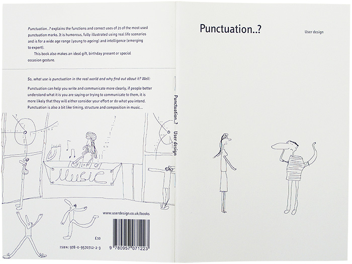
Punctuation..? By User Design. 35 pages. ISBN: 978-0-9570712-2-3. £10.
Forty years trying to master the skills of clarity, consistency, and coherence have not made me a model copyeditor, yet. Reviewing the rules of correct usage set down in this slim volume tests my progress. Always distracted by the larger issues of accuracy and comprehensibility I face in editing translations, I fail in punctilious treatment of the punctuation. I’m an editor who needs to be edited. When User Design emailed the SWET admin address, requesting that we review its book Punctuation..? I gladly agreed, but assumed that it would be one of our more disciplined, grammar-maven type members who would do the deed. The mavens might enjoy the opportunity, but I’ve decided to try one myself.
In perusing the book’s few pages, I realized that I have made progress in these basics. I do know that one of the uses of the apostrophe is to indicate possession and another is to signal the missing letters of contractions. I sigh when I think of how the editors realized that even these rules are not known to many of its potential readers. For SWET readers, who are wordsmiths by profession and are supposed to be experts in this sort of thing, encounters with punctuation also raise issues of entirely different order: such as making the distinction between a usage like “In’ei raisan” (where the apostrophe keeps meaningful elements of the word together) and utawase-e (where an apostrophe is not used; the hyphen is used to show that an element of meaning is tacked on), or whether to use Jun’ichi or Junichi. Even without those usages, apostrophes get 6 pages in this 35-page book.
For brackets, there is a good and terse explanation of their use, something to quote next time a designer uses them to instead of a font distinction in levels of headings. Another tidbit is that guillemets (« and ») are used “in the same way as [English] single and double quotation marks,” but only in French and Italian, please.
I do wish that the description of the colon—“explains or unpacks the statement or information before it”—had been “signals that what follows explains or unpacks...” since those two dots themselves just say “equals.” But in my daily work a more urgent concern is to assure that there is no space before the colon, which looks very odd but happens all the time in a milieu where computer keyboards are going back and forth between Japanese and English. And then there are the 2-byte colons to be on the lookout for.
We have to translate the punctuation, too. To pause for a word about our own guide, thank goodness our SWET forebears bequeathed to us the Japan Style Sheet, soon to be published in its third edition, to sort out the many questions about hyphens, quotation marks, and much more.
Punctuation..?’s dash page is solid and reliable—the sketches of vehicles to illustrate their length distinctions drive the matter home—but my most frequent run-ins with dashes are when they are transformed into hyphens in the transition from manuscript to layout proof and when the font has flipped to something else and they are either too high or too low vis-à-vis the base line. The hyphen is a constant companion in our Japan-related work, mainly because of its ubiquity in various types of romanized words. In proofreading, too, there is the problem of the twice-divided compound word, an issue that InDesign hasn’t mastered yet, it seems. Though perhaps no one really cares much anymore.
“Forward slash” does concern me now and then, but I didn’t realize that the character is slightly different when it is used in fractions or division; there’s a bit of trivia for a wordsmith!
For an inveterate “American-style” editor like me, these succinct pages explaining the punctuation rules for UK style are helpful: I didn’t realize that “a full stop is not necessary after contractions (abbreviations that end in the same letter as the original word),” like Dr (Doctor), Mr (Mister), St (Street)—makes perfect sense, though when you have to try to follow such rules when other abbreviations in the same text may need different treatment (like Dr, meaning “Drive” [as in street]) perhaps it does not always work as neatly as it might seem. The “Quotation marks” pages again illustrate only British usage, though it does seem that even British publishers now allow “American” (CMS) rules, which are intricate enough. Either way must take getting used to.
As the “Semicolon pages” remind us, this mark is extremely helpful. It can be used to make sense of the grammar, especially when translation lures us into making long sentences; more translators should try using the semicolon.
And there the book is suddenly done, with the sketch of a couple gazing out over the water with a smiling tree overhead. For more complex punctuation dilemmas, there are more complex reference works to be had. The sketches in this book have a spontaneous, carefree flair, just in case you were in danger of getting too obsessed about the rules of punctuation.
For more information and ways to order visit https://www.userdesignillustrationandtypesetting.com/books/punctuation/index.html.