January 14, 2022
Six Simple Rules for No-Fail Texts and Signage
Wordsmiths in Japan are often concerned when the English texts they produce are ready for layout and design and want to explain to their clients the pitfalls involved. To support efforts to educate clients tackling English-language layout and design, SWET has prepared this article in conjunction with a Japanese-language companion article. These articles explain six best-practice rules for formatting English texts for signs or websites. Encourage clients to refer to the companion article in Japanese and familiarize themselves with these rules to ensure readers focus on the content of a text rather than its appearance.
These rules are more or less standard in publishing of all kinds. They should be applied in conjunction with the guidelines for any given project, whether they are based on the Chicago Manual of Style, the Japan Style Sheet, the JTA Writing and Style Manual, or other style guide.
1) English texts must be typeset in a Western-language font environment
English letters and punctuation are all single-byte characters and should be typeset in a Western-language (Ōbun) font environment.
If English text prepared in a Western font environment is set in a Japanese-language font environment, it can cause some punctuation marks, such as quotation marks, apostrophes, and dashes (as shown in the examples below), to become double-byte characters, resulting in an unsightly and awkward-looking text. “Smart” quotation marks may also be changed to "straight" quotation marks.
Correct Punctuation Marks
“For if it is rash to walk into a lion’s den unarmed, rash to navigate the Atlantic in a rowing boat, rash to stand on one foot on top of St. Paul’s, it is still more rash to go home alone with a poet.” (Virginia Woolf, Orlando)
Incorrect Punctuation Marks
"For if it is rash to walk into a lion's den unarmed, rash to navigate the Atlantic in a rowing boat,rash to stand on one foot on top of St. Paul's,it is still more rash to go home alone with a poet." (Virginia Woolf, Orlando)
2) Use appropriate English-language fonts
There are two categories of English fonts: serif and sans-serif fonts. Serif fonts have decorative strokes (called serifs), and sans-serif fonts do not.
Serif fonts are easier to read in printed matter and are recommended for signage. Sans-serif fonts are frequently preferred for legibilty in on-screen reading.
Some commonly-used English-language fonts:
Serif: Times New Roman, Century, Garamond, Bodoni, Book Antiqua, Baskerville
Sans-serif: Arial, Verdana, Helvetica, Futura, Optima, Tahoma
Some often-used Japanese fonts to avoid would be: Osaka, Hiragino Mincho, Yu Mincho, Kozuka Mincho, and MS Mincho.
3) Use proper spacing and alignment
English texts are quite commonly aligned flush left with a single space between each word. This method of setting text will be more successful for the designer with less experience handling English text. Justified alignment may be desired, but without expert handling, it can result in inconsistent spacing between words, sometimes with white "rivers" showing in blocks of text, which can make the text hard to read and unattractive.
Proper Spacing and Alignment (Unjustified or Ragged-right Text):
“The habitual use of the active voice makes for forcible writing. This is true not only in narrative principally concerned with action, but in writing of any kind. Many a tame sentence of description or exposition can be made lively and emphatic by substituting a verb in the active voice for some such perfunctory expression as there is, or could be heard.” (William Strunk, The Elements of Style)
Improper Spacing and Alignment (Justified Text):
“The habitual use of the active voice makes for forcible writing. This is true not only in narrative principally concerned with action, but in writing of any kind. Many a tame sentence of description or exposition can be made lively and emphatic by substituting a verb in the active voice for some such perfunctory expression as there is, or could be heard.” (William Strunk, The Elements of Style)
4) Beware of lost formatting when copying and pasting texts
Italics, boldface, underline, and other types of font formatting are often lost when text is copied and pasted between editing platforms. Italicization, in particular, has an important function in texts about Japanese culture, as it informs the reader which words are Japanese. This distinction can be crucial, not only for pronunciation but also for comprehension (e.g., me [eye] vs. me; same [shark] vs. same; man [ten thousand] vs. man, etc.).
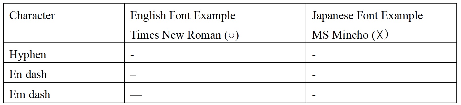
5) Make sure readers can recognize hyphens, en dashes, and em dashes, which are used for specific purposes
Hyphens, en dashes, and em dashes are distinct characters in English that serve different functions. Fonts for Asian languages often change the characters for these dashes, but using appropriate English-language fonts should resolve this problem.
After copying and pasting texts that contain hyphens, en dashes, and em dashes, always check that the characters have not become garbled.
6) Use proper paragraphing style; see your main style guide for the paragraphing rules for your project
The transition to a new paragraph should always be indicated by either indenting the first line of new paragraphs or leaving space between paragraphs.
For signage and print publications, do not indent the first paragraph under a heading. Indent all following paragraphs. See the dummy text below for a visual example. The indent should be set so that it does not create too much or too little blank space.
For websites, QR code text, and other types of digital texts, the open-line method of paragraphing is often preferred. Either one full line or some extra space can be opened to assure the separation of paragraphs is distinct.
Paragraphing for Signage and Print Publications
Lorem Ipsum
Lorem ipsum dolor sit amet, consectetur adipiscing elit, sed do eiusmod tempor incididunt ut labore et dolore magna aliqua. Ut enim ad minim veniam, quis nostrud exercitation ullamco laboris nisi ut aliquip ex ea commodo consequat.
Duis aute irure dolor in reprehenderit in voluptate velit esse cillum dolore eu fugiat nulla pariatur. Excepteur sint occaecat cupidatat non proident, sunt in culpa qui officia deserunt mollit anim id est laborum.
Lorem ipsum dolor sit amet, consectetur adipiscing elit, sed do eiusmod tempor incididunt ut labore et dolore magna aliqua. Ut enim ad minim veniam, quis nostrud exercitation ullamco laboris nisi ut aliquip ex ea commodo consequat.
Paragraphing for Websites, QR Code Text, and Other Types of Digital Texts
Lorem Ipsum
Lorem ipsum dolor sit amet, consectetur adipiscing elit, sed do eiusmod tempor incididunt ut labore et dolore magna aliqua. Ut enim ad minim veniam, quis nostrud exercitation ullamco laboris nisi ut aliquip ex ea commodo consequat.
Duis aute irure dolor in reprehenderit in voluptate velit esse cillum dolore eu fugiat nulla pariatur. Excepteur sint occaecat cupidatat non proident, sunt in culpa qui officia deserunt mollit anim id est laborum.
Lorem ipsum dolor sit amet, consectetur adipiscing elit, sed do eiusmod tempor incididunt ut labore et dolore magna aliqua. Ut enim ad minim veniam, quis nostrud exercitation ullamco laboris nisi ut aliquip ex ea commodo consequat.
No-Fail Signage Checklist
1. The font is an appropriately chosen Western-language font.
2. The text is left-aligned (ragged right).
3. Font formatting (italics, etc.) from the original text is reflected in the final text.
4. Quotation marks, commas, colons, and apostrophes are in single-byte form.
5. Hyphens, en dashes, and em dashes are the correct characters.
6. Paragraphs are indented correctly.
© SWET 2022
Compiled by Rebekah Harmon, Lisa Wilcut,
Lynne E. Riggs, and Sakai Motoki