November 2, 2020
Manga Lettering and Translation
By Susan E. Jones
One of the fantastic aspects of SWET is its inclusivity. Not limited to just one part of the long process of publishing in English, it welcomes writers, translators, editors, and other wordsmiths who contribute in various ways to the finished product. The SWET Talk Shop on August 22, 2020 looked at the skilled craftspeople who are contributing to manga-production by giving the floor to three dedicated manga letterers: Sara Linsley, Brandon Bovia, and Phil Christie. Lettering appreciator Aidan Clarke facilitated the smooth access to their experience and knowledge and asked for answers to the questions some of us didn’t even know to ask.
Manga letterers ensure that every bit of English text in the translated manga appears as it should: seamlessly. In that sense, the invisibility of the letterer may be compared to that of the translator or editor. When the job is done well, the reader is lost in the story without a moment of incongruity. For a successfully completed localized manga, theirs is truly an indispensable component.
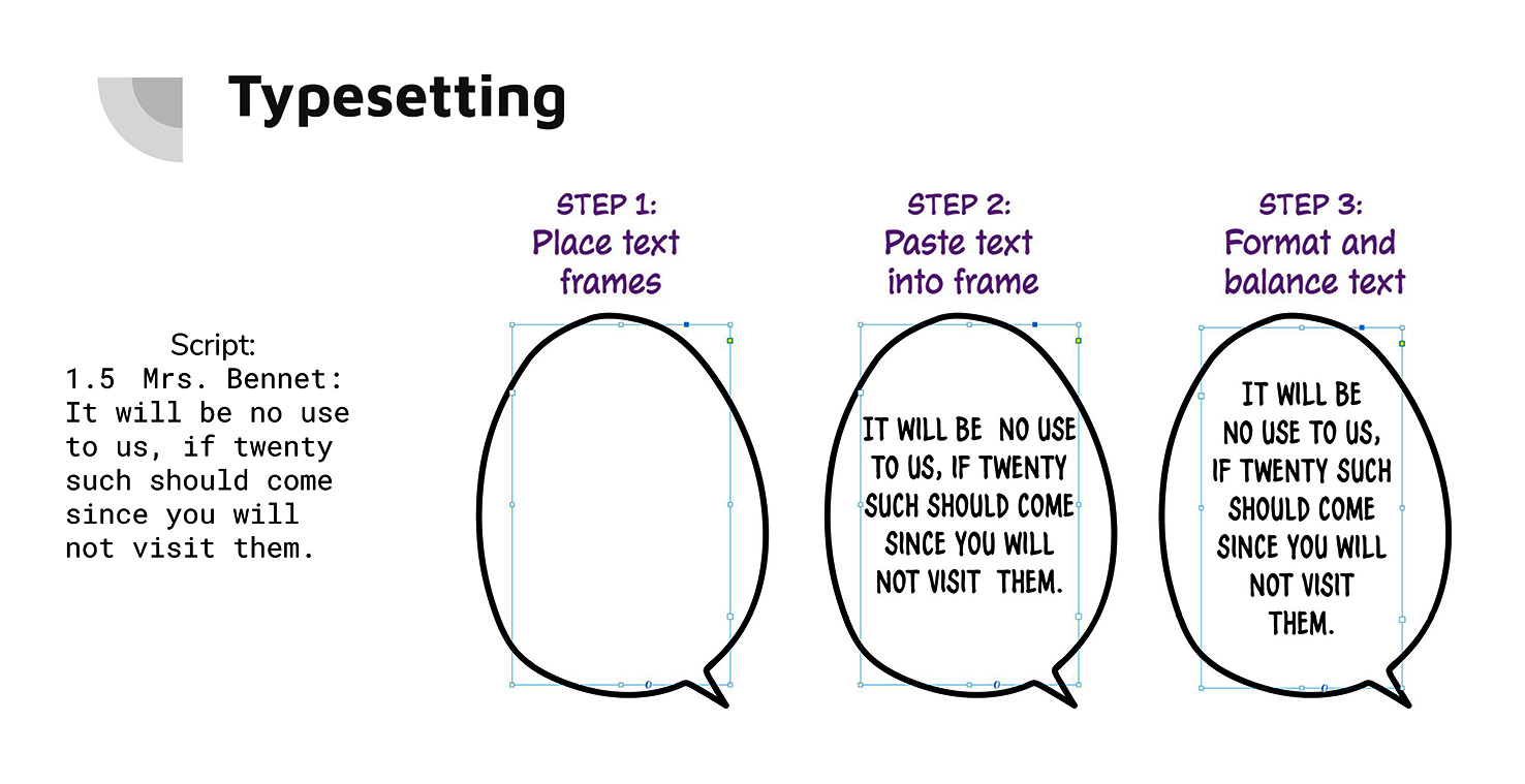
The discussion began with a “Lettering Crash Course” by Sara Linsley, a Brooklyn-based software engineer who is now a full-time letterer, explaining what a letterer does when Japanese manga are published in English. The work includes not only typography (choosing typefaces and knowing how to use them), but also illustration and graphic design. The first step of her process is typesetting the English dialogue contained in speech bubbles. A font licensed by the publisher is chosen and the translated text is pasted into the speech bubbles accordingly. Then the text must be formatted to fit the speech bubble in a balanced manner, dividing and hyphenating longer words as necessary (Fig. 1). Since speech bubbles were originally created to accommodate what is often Japanese text written vertically, inserting horizontal English text into the same confines can be a challenge.
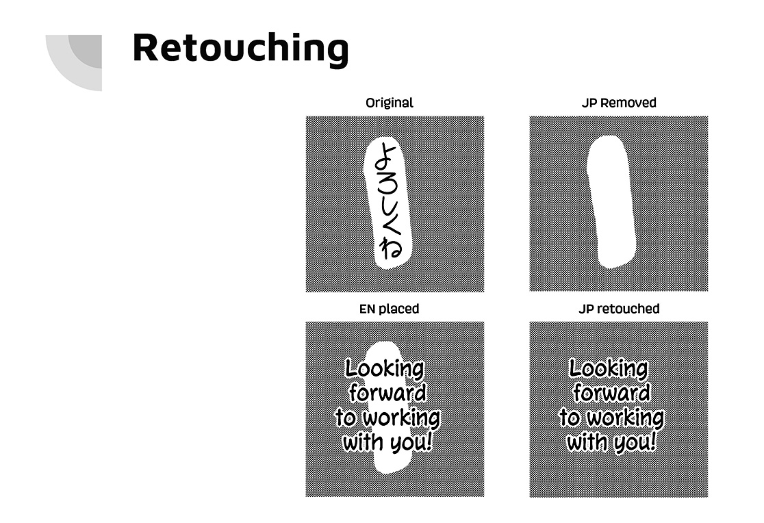
In addition to the text that appears in speech bubbles, manga often have sound effects, signage, labels or explanatory text to describe feelings or situations that appear within the frames, or sometimes overlapping frames. This is where retouching, redrawing, and graphic design are essential (Fig. 2). This process used to be done by hand, but these days letterers usually use Photoshop or Clip Studio Paint Pro to retouch the images. Letterers also need to have illustration skills to deal with redrawing when text and images overlap; matching the manga artist’s illustration down to the type of marker used is essential.
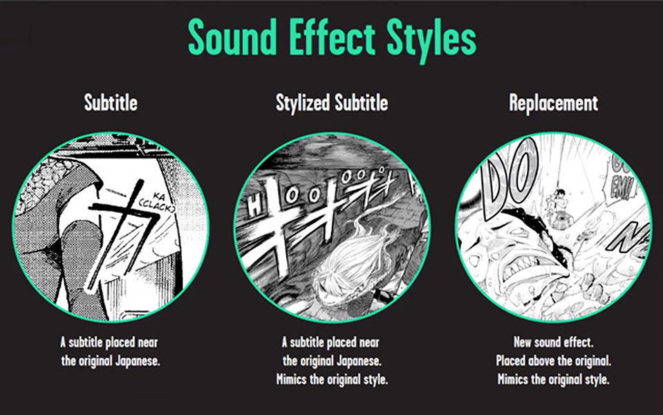
Sound effects may be dealt with in three different ways: a full retouch (the word is created as an original graphic); a styled subtitle (the Japanese sound effect is retained and a styled English subtitle is strategically squeezed into the illustration, Fig. 3); or a plain subtitle (Fig. 4, left image). These techniques require the design skill of the letterer to create text that mimics the original sound effect style and is in keeping with the aesthetic of the book as a whole. In general, the letterer must follow the publisher’s style guide regarding which sound effects style to use.
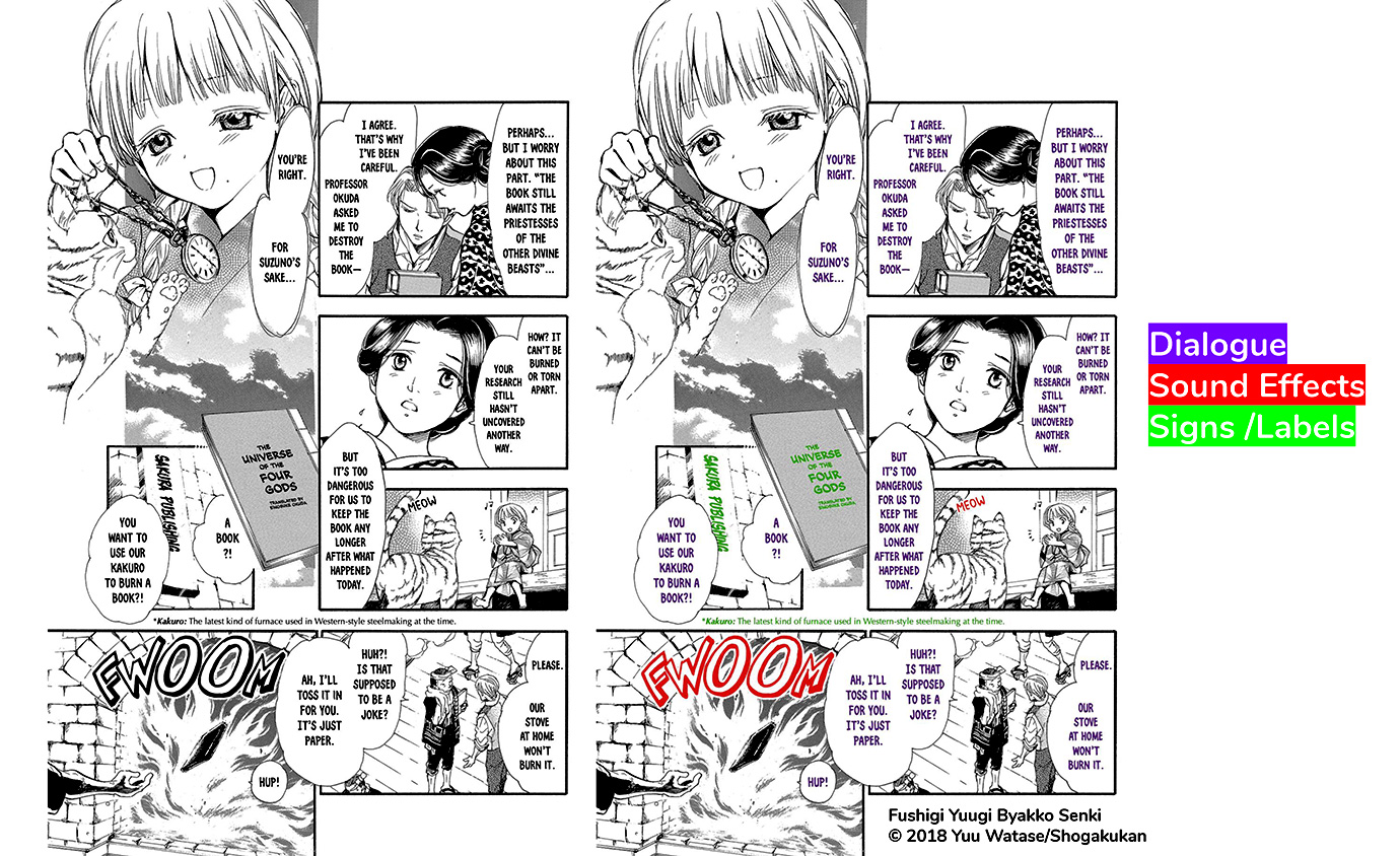
Figure 5 illustrates the breadth of the letter’s work in a single page. From speech bubble text to sound effects and labels, the appearance of every bit of English text that appears on the page is the responsibility of the letterer.
Linsley uses several software programs to achieve her finished product: Adobe InDesign for typesetting, Photoshop for retouching, and Clip Studio Paint Pro for graphic design. Being a software engineer by training, she also writes scripts (and generously shares them with other letterers) for automating part of the lettering process in InDesign. It is important to note that only parts of her process can be automated—most of the work is still done manually. In addition, she creates and shares tutorials on other topics such as how to choose a font and obtain font licenses.
North Carolina-based letterer Brandon Bovia shared his experience over the past three-plus years working with publishers Seven Seas and Viz Media and described the difference between working on a simul-publishing project and a graphic novel. He first entered the world of manga in college by creating original manga. He entered the business as a professional after passing a publisher’s lettering test.
In his early work with the Seven Seas manga publisher, Bovia says his approach was defined by the highly stylized nature of the project; he was bound to follow the publisher’s style guide. With Viz Media, on the other hand, he has had more freedom. His process is to work on a single aspect of the project at one time: first typesetting the dialogue, then designing the special effects, and finally retouching. He finds that it saves time to concentrate his effort on each process separately.
Of the three processes, special effects take the longest. Bovia described one project, the 1980s Transformers: The Manga, in which the retouching of grayscale screen tone and water colors after adding his graphics took an inordinate amount of time due to the plethora of sound effects throughout. It was a labor of love, however, which he said paid off in a beautifully completed work that was for him “career defining.” It prepared him well for his lettering of later action-packed work such as the ongoing series Dragon Ball Super, four volumes of which he has completed to date.
Bovia explained the difference between working on a simul-publishing project and a graphic novel. Some publishers aim to publish the foreign language version of their weekly/monthly manga on nearly the same schedule as the Japanese original to avoid piracy and fan versions. The time constraint of the simul-pub is passed on to the translators, editors, and letterers accordingly. In comparison to a graphic novel, Bovia describes it as “a sprint versus a marathon.” One consequence of the simul-pubs is that the letterer must choose the fonts and style at the outset and stick to them for the duration. In a graphic novel, on the other hand, the option would remain to make changes as the letterer sees how the story develops. One of the advantages of lettering a simul-pub are that design decisions can be made in a fraction of the time, and experience gained there has given him confidence in his work and contributed to his development as a letterer.
Tokyo-based veteran freelance letterer Phil Christie talked about his experience, from a slightly different perspective than Linsley and Bovia, of working through agencies rather than directly with publishers. Agencies send him about ten volumes of approximately 120 pages each to complete per month, and in his case, he has no direct communication with the publisher. He modestly describes his 12 to 14-hour days as “pretty tough,” but necessary in order to earn enough to fulfill the requirements of his working visa. At first he spent a lot of time on full-retouching to replace the sound effects, but over time the agencies placed more value on volume of output rather than meticulously replaced graphics.
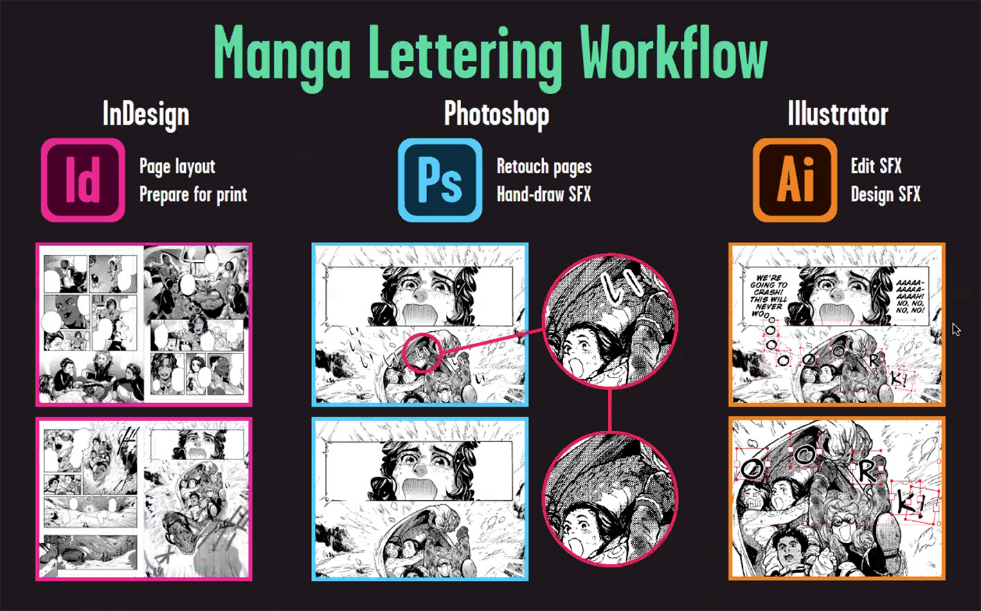
Christie’s workflow (Fig. 6) is similar to the other letterers, with the exception of the software he uses. He starts by inserting dialogue text using InDesign, then removes the Japanese special effects with Photoshop, and finally edits the newly created special effects in Illustrator, which is perfectly designed for smoothly adjusting lettering. In his work on the graphic novel in color Sue & Tai-chan (Kodansha), he had the rare opportunity to create all of his own fonts throughout. Publishers generally require specific fonts for which they have already paid a licensing fee, but in this case they seemed happy with Christie’s design of cute fonts befitting the content. In fact, for non-dialogue text Christie almost always creates his own fonts for a perfect fit to the work and greater reader enjoyment. It has the added advantage of being of such high quality that it defeats the purpose of “scanlation” (manga which are scanned, translated by fans and localized) which inevitably appear upon publication of the Japanese original.
Christie went into some detail about interacting with the translator—which he describes as “super rare.” Thanks to his Japanese-language ability, he is able to spot when the translation of the sound effect is not quite right or “over-translated,” and may ask the translator to modify it. If the translator has inadvertently skipped a speech bubble, the letterer can also provide a quick translation and ask for permission to use it. This saves everyone time in what is already a deadline-driven scenario.
Questions posed by the moderator and participants to all three speakers (answers edited for clarity):
How did you get into manga lettering?
Linsley: I started lettering after I had an internship with Kodansha in New York. They offered me a position in lettering after that (in 2013) and I have been doing it ever since. I recently went full time with lettering after I made a connection to work with Viz Media via a Twitter post. I also connected with Yen Press at Comic-Con New York. After I did a lettering test for them, it eventually led me to getting a series.
Bovia: In high school I started drawing my own comics. My art is very manga-inspired. Ever since I was a teenager, I have been emulating the work of professional manga letterers. Through that imitation, I figured out what I value most in lettering. As for professional work, I got really lucky. Seven Seas put out a call for manga letterers and I passed the test.
Christie: While on a working holiday in Tokyo, I answered an ad on Craigslist that gave me my first job. Then an agency ended up sponsoring my visa and I’ve been working full-time ever since.
Do you speak Japanese?
Linsley: I don’t know much Japanese, but I am able to read on a rudimentary level. It is helpful to be able to read a little bit when it’s unclear from the script where some of the lines go in the panel.
Bovia: A bit.
Christie: Yes, I have N1 (reading and listening skills are fluent). It is not necessary for the job, but it is helpful when the translated text has not been appropriately marked for placement, or when a segment may have been inadvertently missed by the translator.
What software do you use?
Linsley: InDesign (typesetting), Photoshop (retouching)
Christie: InDesign, Photoshop, Illustrator
Bovia: InDesign, Photoshop, LazyNezumi (for rulers like drawing straight or smooth lines) and occasionally Clip Studio Paint for a couple of specific features.
What software do you recommend for a newbie?
Bovia: Photoshop (subscription), Clip Studio (one-time purchase).
Christie: Clip Studio Paint Pro, MediBang Paint.
What are your three favorite fonts?
Linsley: Tight Spot (a new font created specifically for manga letterers), Samaritan Tall, Face Front.
Bovia: Joe Cubert, Meanwhile, and Samaritan Tall—all from Comicraft.
Christie: Wildwords for dialogue, Ariel Narrow for signs, and Zoinks for sound effects.
What do you consider when choosing a font?
Linsley: I have written a tutorial on just that topic. Font widths are the most important consideration—also if the font looks pretty.
Bovia: The aesthetic has to be a good match for the artwork. The decision is 100 percent personal taste.
Christie: I pick it based on the style of the book. A lot of publishers will give guidance on what sort of font we should choose.
Which projects are you most proud of?
Linsley: Fushigi Yûgi: Byakko Senki, Sweat and Soap, and Revolutionary Girl Utena: After the Revolution coming out this fall.
Bovia: Transformers: The Manga.
Christie: Sue & Tai-chan, Yokai Girls, Star Wars: Leia, Princess of Alderaan.
How does the profession treat freelancers in terms of paying a living wage?
Linsley: Part of the problem is that lettering is not valued for what it is. Some people might think that it is just typesetting—just copying and pasting. But that’s factually incorrect. Lettering is a really important part of the process and it should be valued. People deserve to make livable wages and as freelancers we don’t really have much control over that. I’m really fortunate to be paid well by the publishers I work with. That’s why I talk about it on Twitter so much—because I am in a position of privilege and I want my coworkers to be paid decent wages so they have time to make more amazing comics.
What is the typical turnaround time for each project?
Linsley: It depends on the level of work. If it includes a lot of sound effects, I may get four weeks to work on a book. But I am working on more than one project at a time.
Christie: It’s usually a week for standard manga, about ten days for a 200 to 300-page book, three or four weeks for a graphic novel, and 24 hours for a simul-pub. Agents unfamiliar with the industry sometimes make even more outrageous requests such as four books in four days.
Bovia: Transformers (three volumes of 288 – 378 pages) was about three months and I still struggled. Two to three months for full retouch books and 24 to 36 hours for simul-pubs.
What is your relationship with the translator on a project?
Linsley: The only person I talk to is the editor. That person is the center point for dealing with all of the freelancers including me and the translator. The only time I’ve talked to the translators is when we have connected via social media. I love it when they leave little notes in the script, though. It makes my day!
Bovia: Ninety percent of the time, I’m speaking just to the editor. But if I know that the translator is on social media, I can go to them for questions if I need to clarify something quickly. When we’re able to talk or vent about the same project together, it feels more like a collaboration.
Christie: If I have their email address, sometimes I will contact them when I need a bit of dialogue to be shortened.
Would you like to work more closely with the translator?
All three: Yes!
Bovia: Lettering is solitary work, and it is great to feel a sense of collaboration when I have had the chance to talk to the translator.
Christie: I appreciate it if translators reach out, since most of us tend to be freelancers, and it ultimately benefits the final product.
Linsley: The other day, it was nice to get to talk to someone who has spent as much time looking at the book as I did.
What advice do you have for manga translators?
Bovia: Use shorter words! And try to be mindful of how the words might fit in the balloons. I can tell when the translator has taken that into account.
Linsley: Pick a script format and stick to it. That will make it easier for us in our workflow. Another thing they can do is read more manga. Reading English manga will get you used to the type of text and length of text that might fit. The word “embarrassing” comes up often, and this is always a challenge to fit into the allotted space.
Christie: Make sure references to flashbacks are added so I can find the original reference, too.
What requests do you have for manga artists?
Linsley: Layered files!
Bovia: Layered files! They are really beneficial because any hand-drawn elements are embedded and it would save a lot of time for us if they were layered for easier removal and replacement.
Is this your dream job, or is it a stepping stone to another part of the industry?
Linsley: I can’t imagine doing any one thing forever, but I want to work in comic books forever.
Bovia: I think it would be cool to be able to translate and letter the same work. It would be nice to make changes to the text on the fly, and I could do that if I were also the translator. I will keep studying Japanese to make that happen. I would also love to draw comics and animate.
Christie: I love typography and design, so right now I don’t think I could ask for a better job. But if I can apply lettering or font design skills to another industry that might also be pretty fun.
What is your current manga recommendation?
Linsley: I introduce manga to my followers on some Saturdays, so follow me on Twitter!
Bovia: Time Paradox Ghostwriter, Hell’s Paradise: Jigokuraku. Reading manga not lettered by me is a great way to pick up new ideas.
Christie: Dai Dark (not yet published in English), RaW Hero, Time Paradox Ghostwriter, Undead Unluck.
What do you do during your downtime?
Bovia: Model kits, video games, and browsing Twitter, but there’s not a lot of downtime!
Linsley: A lot of letterers are not full-time so they have another job.
Christie: I don’t have a lot of downtime, but I love efficiency. If I’m not working then I’m working on scripts to make my job faster.
Major works:
Sara Linsley: Fushigi Yûgi: Byakko Senki (Yuu Watase), Waiting For Spring (ANASHIN), LDK, (Ayu Watanabe), Sweat and Soap (Kintetsu Yamada)
Brandon Bovia: Dragon Ball Super (Akira Toriyama, Toyotarou), Transformers: The Manga (Masumi Kaneda, Ban Magami), Snow White with the Red Hair (Sorata Akiduki)
Phil Christie: Dimension W (Yūji Iwahara), Fairy Tail 100 Years Quest (Hiro Mashima, Atsuo Ueda), RaW Hero (Akira Hiramoto), Yuuna and the Haunted Hot Springs (Tadahiro Miura)
Find Sara Linsley, Brandon Bovia and Phil Christie on Twitter (@salinsley, @brandonbovia, and @PhilSChristie). Sara Linsley’s tutorials can be found on GitHub ([url=https://github.com/saraoswald/lettering-tutorials/wiki]https://github.com/saraoswald/lettering-tutorials/wiki[/url]).
This article was prepared for publication on the SWET website based on the SWET Talk Shop held August 22, 2020, 10:00–12:00 JST organized and hosted by Emily Balistrieri.

