April 14, 2022
Accessing the Professionals’ Toolboxes
 On February 26, 2022, translator and editor Rebekah Harmon joined veteran translator and editor Lynne E. Riggs to talk about ways the professional know-how of editors and J-to-E translators can be accessed and better shared. Lynne E. Riggs is co-founder of the Center for Intercultural Communication (1990) and spent 12 years as managing editor of Monumenta Nipponica. A recent SWET member, Rebekah Harmon formerly worked for institutions under METI and MEXT and now works freelance. The talk was moderated by Lisa Wilcut, a freelance writer, editor, and translator based in Yokohama. Lisa edits for Japan Library, writes and edits for the Japan Tourism Agency, and works on projects in the Japanese cultural sphere from art and poetry to history and religion. This article is a transcription of highlights from the talk, including updates on recent style-related publications and general advice for translators.
Updates on the Japan Tourism Agency’s Writing and Style Manual
March 2023 English Edition (Download)
March 2023 Japanese Edition (Download)
Lynne: Some of you are familiar with the Japan Tourism Agency signage project that has been going on starting in 2018. In 2019, Juliet Carpenter introduced Lisa and me to Melissa Rinne of the Kyoto National Museum, who is on the Advisory Board of the project, and starting that year we and several other editors have been serving as “style checkers” for the texts the project produces. We first revised their Writing and Style Manual, and it has been further improved over the four years of the project since then. We have just finished revising it again for the fiscal year 2021 and the new edition is now available on the JTA website.
The signage project is aimed at creating better signage and websites about sightseeing spots around Japan. All the writing and style decisions are focused on what is deemed best for overseas visitors to Japan––mainly people who may not know a lot about Japan. The writing and style decisions for this project reflect that priority. That is different from, for example, the Monumenta Nipponica Style Sheet, which is for a specific academic journal with a nearly 80-year history and a readership of mainly Japan scholars, but we have been fortunate to have lots of input from different people to create a guide suitable for sightseeing texts.
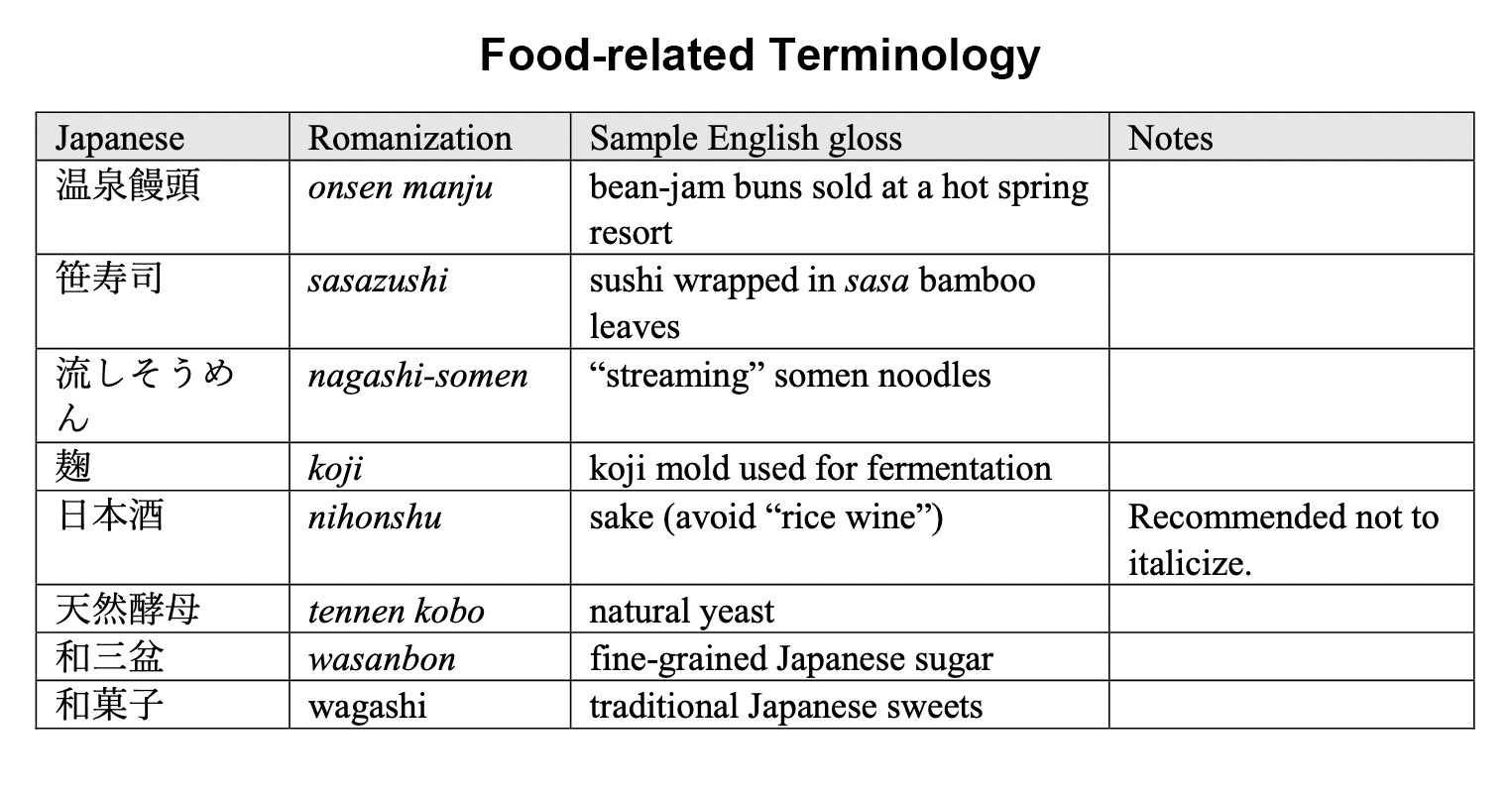
After four years with input from several editors and our Japanese collaborators, the JTA Writing and Style Manual is actually quite reliable and useful. If you are doing any kind of tourism-related material, and you do not want to spend time worrying about what to capitalize, or what to italicize, or how to handle plant names or Buddhist temple names—that kind of thing—you can find a lot of helpful information. There are charts about shrines and temples, how to treat the names of Buddhist statues, and a glossary of recommended terms. These are things that came up in the course of the actual text writing—by no means comprehensive.
(click image to enlarge)
One of the things that is new in this edition is a section called “Romanized Japanese and English Text.” It presents the different ways you can introduce Japanese words when they appear in English text. Should I use quotation marks? Should I use italics? (You would never use both at the same time.) Should I put the gloss in parentheses? Work it into the sentence? All the different options are there, and the idea is that any of them can be used. You do not have to stick to one.
These are things that editors have done for decades, but they have not really been written down. This is one place where we are starting to articulate what professionals do and show our toolboxes, so that people who may not have been involved in this before can see their options and what worked well in the past. All of this information, of course, has been tested through print publishing over many decades, so we believe it is acceptable. And the JTA style guide assumes that you can look up things in The Chicago Manual of Style, the Japan Style Sheet, and other style guides.
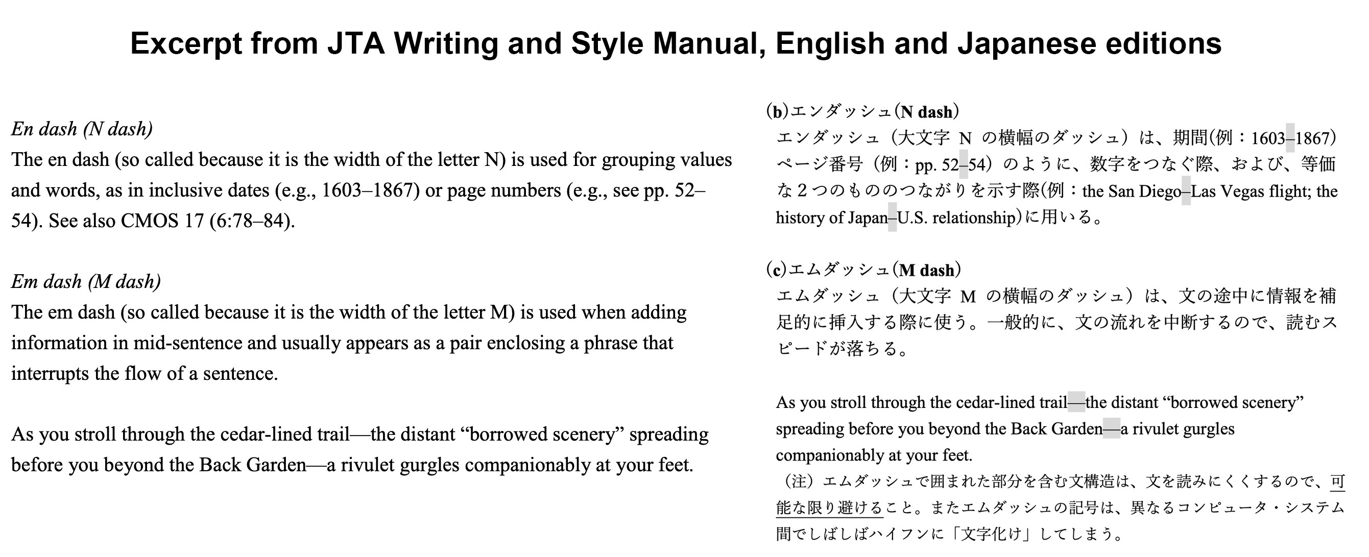
Part 1 of the Manual is about how to create signage. It covers writing, from crafting an attractive opening to such issues as using strong subjects and verbs, making every word count, and organzing information logically and chronologically. It also includes guidance on the collaboration between writer and editor and between editor and stakeholders of sightseeing sites. That’s the production stage of signage. What I have been most involved with is Part 2 of the Manual, which is concerned with technical style consistency and writing clarity and style. The style guidelines are specific: what dictionary to use, how to handle paragraphing, romanization of Japanese, use or non-use of macrons, punctuation, basically the same as what we say in the Japan Style Sheet, and then the section on romanized Japanese in English text.
(click image to enlarge)
Having a style sheet saves time. There are different ways of deciding punctuation rules, but, for the sake of consistency, we just established a standard to follow. If you are creating a style sheet for your own publication or project, this is a good category to make your rules in, whichever rules you want to choose. There is a good section in the Manual about the distinction between hyphens, dashes, en dashes, and em dashes. This can be helpful if your client queries the use of such marks in your texts.
Now this style guide is completely available in Japanese, it is a pair; and the FY2021 edition has been edited for greater readability over past versions. So one of the things that is useful about it is that we can show it to clients who want to have an explanation of the rules that we follow. Japan Style Sheet, unfortunately, is not in Japanese because it was written for people who would know English to begin with.
Recent Publication of the NICH Style Manual for English Texts
 Rebekah: I joined a SWET talk last year on the JTA style manual. I think you also had the editors there, and it was quite an in-depth discussion of the decisions they had to make going through it. And I remember thinking while I was looking at it, “Oh, this is really great. We should have this at the Tokyo National Museum,” where I was working at the time.
I talked to Lynne afterwards and she said, “Why don’t you make one there?” And I thought, “Oh, that sounds like a lot of work. I don’t think I want to do that.” But then I also realized that we had these really amazing people at the national museums across Japan, which are administered under the umbrella of the National Institutes for Cultural Heritage (NICH).
So, I set up a Zoom meeting with them and sort of pitched the idea, expecting to be rejected. “Hey, do you want to do a huge project on top of your regular work for no extra pay?” But, to their credit and their sort of brilliance and generosity, there was an overwhelmingly positive response that this was something they wanted to do. So, we started this project. They have it up now and we only started it last March. They did it in a year.
I’d like to explain how it was written. We didn’t have a lot of time, so I wrote the first draft at the Tokyo National Museum, and just sort of wrote out the rules we were already following. And then I sent it to each institution, and they were supposed to either say, “Yes, we follow this rule,” or write their own rule if they followed a different rule. So, it’s a little bit convoluted in the sense that there are several institutional differences listed within the document, which might be a little confusing…but there’s permanent signage up in these museums. Some institutions use BC/AD, some use BCE/CE, the way you romanize temple names, et cetera—all this would be a monstrous project to align all at once and reprint all the signs.
To tell you some of the people involved in the project, I was largely handling it as the editor and writer until I left the museum in September. From there, Dr. Peter Yanase, who works at the Nara National Research Institute for Cultural Properties, took it over. He’s a very logical, brilliant person and he spearheaded getting it translated into Japanese, getting it published, and cleaning up the layout. He put in romaji charts and everything. So, a really big thank you to Peter, although he’s not here today.
And then Melissa Rinne, who might be here later today. She’s a major powerhouse in Japanese art in Japan. She was previously a curator at the Asian Art Museum in San Francisco and is currently a senior specialist at the Kyoto National Museum. I think a lot of people here know her, but if you don’t, she has an encyclopedic knowledge of Japanese art. You can ask her anything, and she can tell you. And she was instrumental in getting this project done.
And then other people from the other institutions: at Tokyo National Museum we had Frank Witkam, who is a specialist in ukiyo-e and graduated from Leiden University in the Netherlands. And he’s also a part-time lecturer at Rikkyo University. He’s one of those people who has very deep knowledge of the Edo period. After you go to dinner with him, you sort of feel like you should get a little diploma because you learned so much during the dinner.
And then at Nara National Museum, we have Mary Lewine, who is a PhD candidate in art history at UC Berkeley. She’s working on her dissertation today and couldn’t join us. And then we have Rachel Lam at the Kyushu National Museum. She’s fluent in Chinese, Japanese, English. And that’s a really great asset, because if you study Japanese art, a lot of it has close ties to Chinese art. And having someone who’s fluent in those three languages was really helpful in making the style guide. And we also had Daniel Borengasser, who joined Kyoto National Museum in April last year. He’s a PhD candidate at Harvard in Japanese art history, working on Buddhist art.
I knew we had all these great people at these institutions, and it seemed like we never really collaborated. So the style manual was sort of an initial vehicle for collaboration, and we got all this expertise shared. I’m really hoping it’s going to be a good tool for others, including translators, to use.
We made a Japanese and English version, which we wrote for two different audiences, as you'll see in the content. The first audience was for people involved in English-language translation and some of the decisions they would have to make, like, when you’re translating about art schools and acting lineages (p. 50), how do you describe that in English in a communicative way?
And the other audience we were writing for was Japanese staff at the museums or other places who are involved in producing English publications and often have sometimes very basic questions, like the spacing around parentheses, or where do you put commas when you have quotation marks, and stuff like that. Some of this is probably too basic, but you might have clients of your own who struggle with those questions. Having something to show them in Japanese is hopefully an asset.
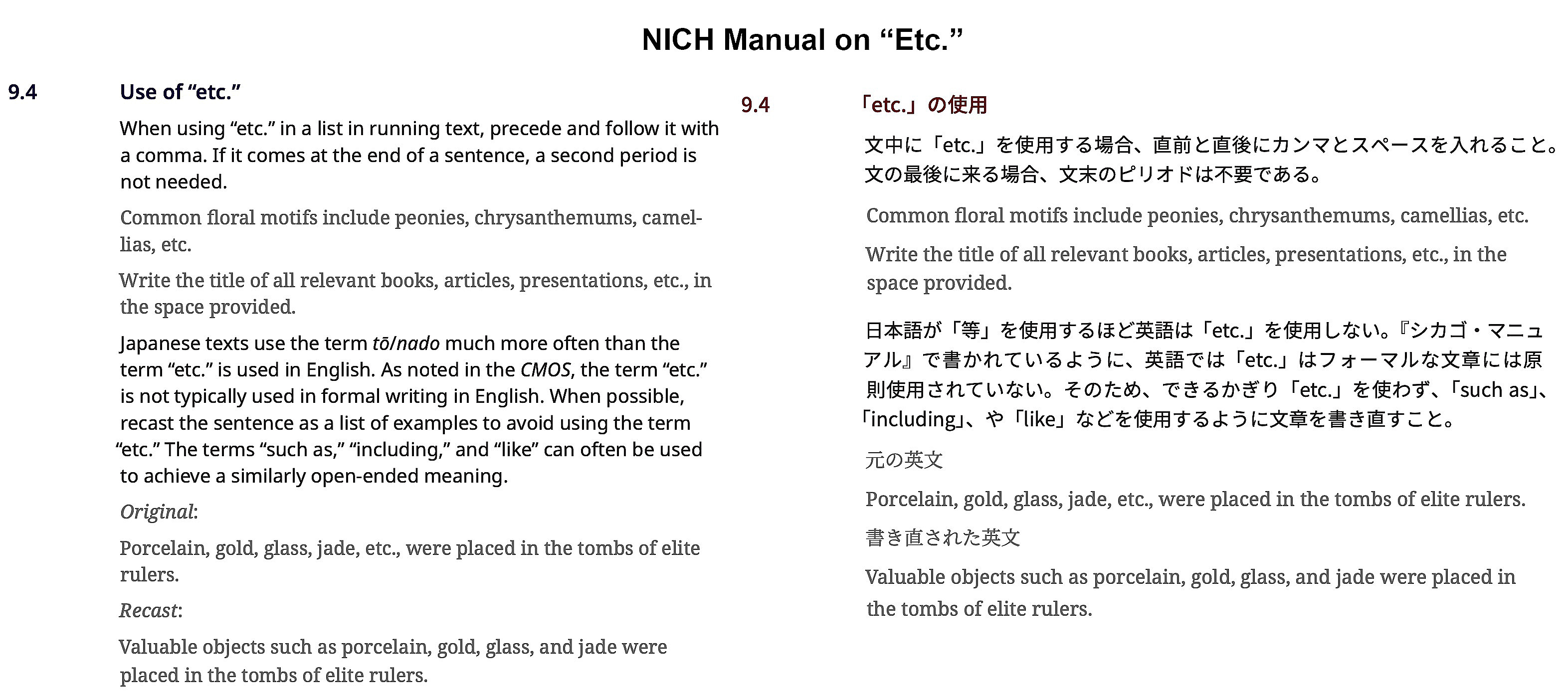
For example, we included an entire section on the use of “et cetera” in Japanese, because it is used so much, even in regulatory translation. I would often be kind of horrified to see the title of a law that ends in et cetera. How can a law apply to “et cetera?” It’s a totally different cultural concept of how to express open-ended lists. That was something we also wanted to get in here.
As for the JTA manual, we assumed that editors and translators could look things up in The Chicago Manual of Style if there was something not covered here, and that’s what we were mostly following. We used American spelling, so we referenced Merriam-Webster. As I said, Dr. Yanase was very kind in getting a lot of this sort of basic information included in a very readable, comprehensible format, like the romanization chart. It is actually quite similar to the one in the Japan Style Sheet.
Lynne: This is very useful because Japanese are taught the other romanization system in schools. So sometimes the Hepburn system is not as familiar as we expect it to be, so it can be a valuable reference tool.
Rebekah: I’m hoping that can also cut down on the email people will have to exchange explaining stuff. And you can see already in the first romanization section there were two institutions that had differences. They would always use “cch” instead of “tch” for the geminate consonantっち. That’s hard to change on signs and museum guides, so we needed to allow for differences in styles. I think we were understanding about that (pp. 40–41).
And then of course, because we’re working in museums, we have to do Chinese, Korean, and Sanskrit romanization as well. And some of you might deal with that with your clients, too.
Lynne: A good place to look for ways of handling that.
Rebekah: And then section 4.3 (p. 45) is the one that I always kind of laugh about, because we did “Names of Japanese Religious Institutions,” but because the draft was written in Tokyo, this was the TNM rule, and then you go on and you get the KNM rule, and then the NNM rule, and then the Kyuhaku rule—nobody agreed. They were all different.
Lynne: Well, the shrines themselves, they insist on, like “x jingu shrine,” right?
Rebekah: Some of them, yes. If a religious institution indicates a specific preference when lending a work of art or sponsoring an exhibition, a museum has to follow that. We have to be sensitive to what they want.
Lynne: Yes, that was something soundly learned in the JTA project.
Rebekah: People and institutions have really specific preferences. The manual also addresses place names and things like that, which are sections that are probably helpful for everyone. In general, we tried to follow the Japanese government’s rules on this. The bottom line seems to be: use a place name that a Japanese person would readily recognize if mentioned by an overseas visitor. If we say “Tama River,” they would understand. But if we say “Ara River,” they might not get it until you say “Arakawa River.” We’re trying to follow that rule. Although I don’t think it’s necessarily intuitive for non-native Japanese speakers to know which one is going to be understood or not…but anyway, this is the new style manual, which is now up online and available for everyone.
Lynne: That’s really a big accomplishment. Big news in our world, wouldn’t you say!
Lisa: Can I interject just for a second before we move on? I think it’s an amazing point that there are so many differences and that that might be something valuable…It’s kind of like the way there are different ways to say things in English.
Is there some value in recognizing and accepting that there are different ways to do things in Japanese, and maybe keeping this as a reference for those options? What do you two think on this general question, should there be more of a move towards establishing “the” one way it should be done in English, or do you think we should be more flexible and recognize variety?
Lynne: I come from the affirmative-of-plurality school, because the Japan Style Sheet itself began with rules from four or five different publishers. And we put them together so that you could pick the set of rules that you wanted, according to the kind of work that you were doing. And we thought that was the best, because there were so many different contexts in which people work. The Japan Style Sheet gives options. It doesn’t say this is the “right rule.”
It tells you, this is the way this rule was made and why. And you can judge for yourself whether it is appropriate for you. And, I think that because even though Japan tends to like conformity, actually on the ground, it’s this diversity which really drives Japanese culture.
And it’s okay if there isn’t total agreement on every little thing, but it can be hard to deal with editors who are very troubled by inconsistency in some cases. So, I think we’re in a good place now where we have this advice for how to do it and you have to exercise good judgment in deciding which is the right way for you.
Advice on Design and Layout
Lynne: Rebekah asked me to talk a little bit about this, because I don’t know how many of you have had a chance to work with design software. If we’re translators and editors, we don’t do that much, but I did have a chance to work first in QuarkXPress and then InDesign when I was working for Monumenta Nipponica, and I learned close-up what happens to text when it goes into design software.
InDesign is wonderful if imported correctly from Word. It will even import the italics correctly. But if the designer has only done Japanese text in the past and is unfamiliar with how the software handles English, the results can be rather awkward or unnatural. If a proper English-language font is chosen, the software will adjust the basic settings automatically. The designer can fine-tune those settings using the paragraph or paragraph style, but the settings need to be appropriate to English.
The main settings that need the designer’s attention have to do with the hyphenation, justification, the paragraph indents, the word space and line spacing—then, when they import text via Word, all of the care we’ve taken to create a clean manuscript with italics and punctuation in the right place—smart quotes, smart apostrophes—will all survive, and our work will only involve things that we missed in the manuscript. However, we’re often working with Japanese designers who have not worked with English texts before. There is a lot of help on the Internet, but often it is entirely in English; they may be interested in any help they can get, even from non-designers like us.
I have often found, even as a translator and editor, that when I asked, “did you set the program in eigo danraku settei?” a lot of times I would hear, “Oh, that made a big difference!” It pays to know a little bit about design software when people you are working with, though they may be design professionals, are struggling in unfamiliar territory.
Design software is now extremely complex and no doubt changing all the time, so we have to rely on the professionals, but some design literacy is something that our mentors in SWET have always encouraged, so however we can increase our awareness of the technology is valuable. A few basic insights about how it works can be a useful part of our toolbox for getting things done as best we can. For example, it may still be necessary to advise setting the hyphenation to hyphenate at 3 letters or more (rather than 2, which looks bad) and allowing no more than one line with a hyphenation in succession for best results.
Also, when I create a document in Word, I make sure to turn off all the autocorrect functions, use a very plain layout, and, as pointed out in the NICH Manual that Rebekah just showed us (see 8.1 “Japanese Characters in English Text” (p. 56)) you want to make sure there are no Japanese characters unwittingly embedded into the English texts. Then things go much better, and I try to anticipate the paragraphing style that will be used by the document at the end. I always use only Times or Arial or very plain and legible font for my manuscripts, which is easier to see for all the people one might be collaborating with.
Rebekah: You told me yesterday there’s actually—which I had overlooked—there’s a part in the Japan Style Sheet called “Kanji in English Text” that I should have read because I have often struggled in the past with the kanji being a different size.
Lynne: Kanji in English texts is something I learned at Monumenta Nipponica also because the journal’s policy is to place kanji into the English text for names, places, some terms, and in their lists of references. It is an English publication, but has included kanji ever since it began, in various formats. In that English text world, kanji are made to look at home, not awkwardly out of place. The punctuation around the kanji, we will note, is usually English punctuation. If, by contrast, the text language is Japanese and you have English in that font world, then the punctuation will probably be Japanese, although I see editors doing different things in that regard.
But making the English-with-Japanese interface work was something that we did write about in this “Kanji in English Text,” which is in the Japan Style Sheet, third edition, available online. Parts of that may be a bit technically outdated. It is true, as you say, that if the kanji are the same font size as the English, it will look very awkward. Making the kanji about 2 points smaller than the English is usually workable.
Six Simple Rules for No-Fail Texts and Signage
Rebekah: When we made the NICH style guide, we also wanted to make a second volume on design and layout challenges in exhibition catalogues and posters and other things…because oftentimes Japanese staff would come to us with questions. So, we wanted something to give them, but as I said, we had just launched this collaboration last year, so the opportunity to do that hasn’t quite materialized yet. And then, Lynne had mentioned to me that in the JTA project as well, thousands of lovely texts had been created, carefully crafted, but there were some instances when the actual signage on sites or online turned out to be printed in not-so-lovely ways.
Lynne asked me in December if I would draft an article and I did, and then with input from Lynne and Lisa, we moved things around and improved the clarity. The creation of a Japanaese companion article was also a process that prompted us to clarify and improve our English article. It covers six things that have caused a lot of trouble in my past work. You’d think you’d written a prize-winning translation, but after it has been put into a layout, it comes back in this crazy font, or with 2-byte characters interspersed. And you feel devastated: “Oh no, now no one’s going to read it.” The problems are really small and elementary, but so easy to overlook. So this pair of articles should help us and our clients avoid such failures.
As Lynne mentioned, you have to have a Western-language font environment to avoid punctuation ending up garbled into a Japanese font, which disturbs the legibility of an English text. And we also include the fonts that are preferred to use and the advice to really avoid Japanese fonts when setting English text. Spacing—you’ll often see English texts that have been set to justified spacing, as they would be in Japanese, but the word spacing has not really been adjusted properly as it would be if the text were set in justified alignment for English.
Lynne: To achieve natural-looking justified text requires careful attention to the hyphenation settings in the design software and tweaking of the default word-space settings depending on the font; it takes a fair amount of technical expertise. In the JTA Writing and Style Manual, we advise against justified text. That’s kind of autocratic, but in the end, for people who don’t work regularly with English texts, it will be easier.
Rebekah: Especially in Japan, I think it’s just better, because you’re going to save a lot more time that way than trying to make it all evenly aligned.
And as you said earlier, you can lose italics in the import to design software and this article points out that that distinction can be crucial, not only for pronunciation, but also for comprehension, whether you’re referencing me or me, same or same, man or man. And how hyphens, en dashes, and em dashes can get all messed up when you’re using a Japanese font. And last was paragraphing, because you’ll often lose indentation when something is transposed for publication.
And SWET member Sakai Motoki very kindly translated the article into Japanese for us. When working with clients—what I often do is copy and paste this link and send it with the glossary or style sheet that I’ve created for the project. It’s a kind of insurance that they will at least be cognizant of these things when they publish. That’s also available online.
Translation Tips
Lynne: I’ll just say a few things that Rebekah encouraged me to talk about. They’ll be obvious to many of you, but for example, one of the things that Rebekah also said was that she’s very anxious that translators tend to try to make translations that are so-called “accurate.” What is “accurate” may not be clear. The idea, which I have also been taught from the very beginning forty-five years ago, is to translate the meaning; not just the words, but what is behind the words as well. This is the advice that we have found in a business sense to be the most successful—to translate the meaning. If you try to translate faithfully word for word, you will have nonsense and it doesn’t work for communication. But you do have to be accurate to the meaning. You have to really know what the Japanese says. So, you can’t be distracted by phatic expressions, the “interactinal language” that is so often found in Japanese texts, as explained by both Yoko Hasegawa (The Routledge Course in Japanese Translation, 2011, p. 59) and Judy Wakabayashi (Japanese-English Translation, 2021, pp. 118–19). You have to grasp the meaning from the tools that are there in the Japanese to assure that you understand the logic of the original.
You may often find that you need to switch the order of paragraphs or of sentences within paragraphs in order to make it sound more natural in English. This is perfectly permissible and encouraged by professional translators of experience. You don’t want to go too far, especially if your client doesn’t want you to do that, but you may have more leeway than you think.
If you are working with the kinds of texts where you have the freedom to go beyond chokuyaku, then massaging the order of sentences and phrases can create a more successful result. Also, you have to decide, for example, how much Japanese to include for specialized terms or references and how much not to include. Who is your reader? Will they want/need this? Is it distracting? Ideally, you want to make your style choices right when you’re translating. You can save time and effort if you ask your client first and find out what style they’re going to follow when you start. Quite often they have not even thought about the matter until you bring it up, but this is something that translators today can definitely do better. Not to just translate, but to follow an agreed-upon style, and increase the polish of the end product thereby.
We found that following the style that the client wants means they come back. They know we’re going to make their English versions look the way they expect them to look. The main sort of skill that you need in using all these tools is good judgment, and that’s the kind of judgment that we all gain over years of working with collaborators, being receptive and flexible, and working with different kinds of texts and having the tools in our toolboxes to meet each specific situation.
Why am I going to capitalize this here and not there? Am I going to capitalize an italicized word because it has a proper name in it or not? There are all these little trivial things that we editors deal with that we learned over the years. And they’re explained in style guides, but we have to sort of internalize them.
This is the kind of thing that our clients are going to rely on us to have. So, it really behooves us to develop that good judgment, because that’s the one thing they really don’t know about. They don’t realize that that’s sort of the core of our professionalism. Another main thing I wanted to say about translation also, is that translators need to be really well educated about Japan; just having “Proficiency Level XXX” doesn’t mean much if you have no historical or literary background about Japan; and you have to keep on educating yourself constantly.
 I have the Encyclopedia of Japan here. I really recommend it—I mean, we all use the Internet for everything. For example, there was a case recently where we needed to know about the siege of Osaka. Is it a siege or sieges (plural)? What was going on there? You don’t need advanced degrees to do this; you just need to know where to look. And you can get a nice, clear, accurate explanation in the EOJ that will clear up the editorial questions that come up when you are editing about a particular topic.
Rebekah: I kind of wanted you to talk a little bit about it, because as you were saying before, we have a lot of—I mean, a beginner in any field kind of tends to sort of float around a bit, but particularly machine translation and other tools have made it possible for people who did not necessarily spend a lot of time thinking about translation theory to just sort of start punching out translations very quickly and sometimes for very low cost.
The instinct when you’re beginning translation might be to just look at the Japanese text and write it in English without checking anything else—just trying to get the meaning across. For me personally, I don’t just sit down and look at the Japanese text. Usually, I would take a look at the Japanese text and the field and the audience it’s designed for. And I would try to find something analogous in English, maybe not on the same topic, but like, for example, if it’s a company selling bags, I would go look for a big brand in English selling bags.
I would really try to soak up that mood and style that they’re using and that expectation the reader has, and then go to the Japanese text and see what kind of impact they’re trying to make on Japanese readers and, depending on cultural associations, I might not replicate it exactly, but try and get that same mood and emotion in the English texts. Using reputable sources is also key, and not just sort of plucking random stuff from the Internet and thinking it’s good.
Lynne: Well, the Internet is great and machine translation (MT) can be useful, as we were discussing on SWET-L in a recent thread, but there’s definitely so much more that we can do with our knowledge and sensitivity. And I’ve been building on my knowledge for forty years and I'm still doing it. It’s endlessly interesting and I’m so glad I followed this profession because I get to keep doing it.
That's the part of the message I want to get across is that the machines are great and the technology is great and everything, but there’s a lot that only we can do, and we should be very affirmative about that.
Other Resources
Several other resources were mentioned during the talk shop and are available on the Japan Style Sheet website’s “Further Reference” section.