March 31, 2006
Markuz Wernli Saitō on Book Design
by Peter Goodman
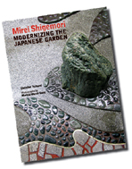
A Swiss designer with a background in commercial and website design, Markuz Wernli Saitō was the photographer/designer of Stone Bridge Press’s Mirei Shigemori: Modernizing the Japanese Garden, a book based on the doctoral dissertation of author Christian Tschumi on the twentieth-century scholar and garden designer. On January 22, 2006 Wernli Saitō spoke about how the photographs were chosen and the design conceived and executed.
Peter Goodman, president of Stone Bridge Press, and long-time SWET stalwart, contributed Editorial Insights from his perspective as supervising editor of the project.
"Garden books are known for their fine, double-spread panoramic views," said Markuz Wernli Saitō, "but I wanted to show that there was a 'new way' to look at that very traditional subject." A new series of lectures at Good Day Books started off with Wernli Saitō's presentation on the design and layout concepts, and publishing savvy that went into creating the recent study of Kyoto scholar and avant-garde garden designer, Mirei Shigemori (1896–1975).
Revealing ideas developed out of his experience in Switzerland as a commercial designer and his involvement with website design in California’s Bay Area, Wernli Saitō generously shared the harvest of his collaborative experience on the book with Stone Bridge Press (SBP) Peter Goodman as editor, and the author, a landscape architect based in Zurich, Switzerland.
Various agendas impinge on the creation of a book. First, there are the commercial priorities: Wernli Saitō’s natural impulse to design the inside of the book and then its cover was nipped in the bud by the need to produce a cover first for promotional purposes. Tempering Wernli Saitō’s untested impulses to experiment with "something more imaginative" were Goodman’s editorial and publishing wisdom. Drawing on his experience overseeing publication of such honored tomes as Itō Teiji’s The Gardens of Japan (Kodansha International, 1998) and SBP’s own Gardens of Gravel and Sand (Leonard Koren, 2000) and The Art of Setting Stones and Other Writings from the Japanese Garden (Marc Peter Keane, 2002), Goodman guided decisions on fonts, paper, cover design, and so on. And finally there was the author, Christian Tschumi, who had done a seminal study of an avant-garde garden designer little understood even in Japan.
 In choosing a photograph for the cover, Wernli Saitō explained his Swiss-trained instinct for simplicity and his self-devised test—looking at how the cover will look when displayed on an Amazon.com webpage—in order to see whether the cover itself will sufficiently reveal the nature of the book and what it is about. "Online sale," he noted, "plays a role in the design" that should not be ignored.
When it came to choosing the fonts, Wernli Saitō explained how he had initially assumed that a sans-serif font—typically used for a "modern" typographical image—would be best for the text until he encountered opposition from publisher Goodman, who was firm that only a serif font was suitable. Sans serif fonts, he said, always reminded him of martial arts books. Searching among the innumerable options even in the serif variety, Wernli Saitō said he sought one that would be legible, up-to-date looking, and that he felt would look just as good five years hence. He decided upon Utopia for the text and Bell Gothic for the display font.
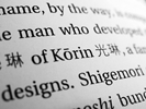 Another aspect of the typography was the combination of Japanese characters with English text, and the book seeks inconspicuous and attractive ways to furnish them for the scholar and Japanese-using tourist while not putting off the general reader. In choosing fonts and calligraphy for the kanji, Wernli Saitō expressed his belief that the kanji "need to be bigger than the romaji." There has been some criticism that the kanji are too large, but he defended his decision by explaining he wanted them to "have room to breathe."
"Cross-linking for Coherence"
Illustrating his talk with numerous slides of his photographs and designs, Wernli Saitō explained the color scheme of the book which features, for title lines, subheads, and pull-quotes, the rust red (bengara) Mirei Shigemori used to color concrete. Backdrop hues for the diagrams of the gardens were selected so that they would resonate with the photographs.
 Striving for "a consistent iconography," the design reflects techniques used in website design, with numbered references to the maps in the photograph captions, cross-linking of images with the content, and contrivances to draw the reader deeper into the book (as into a website) by "link-like" correspondences between the text and photographs. Wernli Saitō said more than once that he was determined to use whatever it might take to say, "Reader, please open your eyes," and to indicate
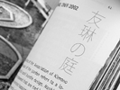 what is out there waiting to be seen and experienced. He also applied insights gleaned from his work with websites to make sequences of photographs convey stories, showing pages 56 and 57 as an example of this strategy.
To ensure maximum correspondence between the photographs and the text, he decided to use a "flexible column width" design, a composition that makes it easier to place the necessary detail photographs close to the relevant text. Each chapter combines large page-size overviews with smaller perspective shots and even smaller, closely cropped detail photos.
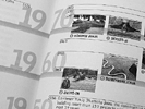
Making photographs into icons is another way of integrating images and text. Calling attention to the timeline at the back of the book, Wernli Saitō explained how he had managed to pack a great deal of information into its two pages and also make it easy to parse, partly by using icon-size photographs.
Asked whether he had taken his photographs based on his reading of the text, Wernli Saitō reflected that, although he did know a fair amount about Mirei’s gardens before starting the photography, when he found himself in the gardens themselves, he tended to become absorbed in the experience, letting his eye lead him rather than editorial instructions. Clearly captivated by Japanese gardens, he confessed to having trespassed
within more than one in his zeal to obtain a desired image, sometimes relying on his "ingenuous foreigner cachet" to get him out of trouble. He said he ended up having to go back to photograph the overviews and to get the colors right for the book. Ultimately, the text was shorter than expected, so that despite the original plan of a 50:50 ratio of text to image, it proved possible to incorporate more photographs.
Collaboration
The people involved in the project were far apart, Wernli Saitō noted, so most of the conversation was conducted using FTP files—file transfer protocol files—that were put up on a server where they could be viewed simultaneously by all parties. They would then engage in discussion at each stage by email or sometimes by telephone. The project started out fairly slowly and at a relaxed pace, but then, as the deadline neared and the design began to emerge, the discussion became quite intense and sometimes tense, he said. In the case of this book, it was his responsibility to read the text carefully and design the book to enhance and reflect the text faithfully. The process extended over about two years, with many back-and-forth rounds working with the publisher and author.
Wernli Saitō said that the effort put into the book had been exhausting, but he felt proud of it and certain that, unlike projects he may have done more hastily, he will be able to look back on it in five years and still feel sure that he made the right choices and invested enough time and thought in its creation.
Whereas one often wishes that traditional book and graphic design arts might rein in some of the excesses of website clutter, over-layering, and breathless motion, perhaps the pendulum has already begun moving in the opposite direction. The talk offered an entertaining and enthusiastic glimpse of how book design may begin to change as the younger generation of designers, with close orientation to the Web and image-oriented information, takes the lead.
Photo reproduced by kind permission of Markuz Wernli Saitō
Book photos © 2005 Stone Bridge Press.
From Newsletter No. 111 (March 2006)
Editorial Insights
Markuz Wernli Saitō deserves a lot of credit, as he was the one who tied all the different aspects of editorial work, design, and production into a single package. The text came first, so his primary job was to give it a graphic foundation. His color choices for the garden plans and the back-matter timeline and locator maps, played a major role in giving this book a very distinct look and feel. Those of us in this biz "know" what most Japanese garden books look like, and this one breaks the mold. It has all the formality and coordination you expect in such books, but pushes the genre forward without appearing too much the product of an overenthusiastic designer.
On his first layout, the photos were almost all full page and the text was full width. At our suggestion, Wernli Saitō went back and broke up the photos into large and small, which enabled the text to flow around the photos and integrate better with them. While we suggested ways to improve the presentation, it was Wernli Saitō who figured out how to make it happen, and then some. The way the book looks is almost entirely the result of his vision and determination.
One more thing: Wernli Saitō worked very closely with our printer, TWP, in Singapore, on color settings based on the kinds of ink and paper to be used. We all agreed that we wanted this book on uncoated stock, and that meant there would be a bit more dot gain, which had to be taken into account when scanning and reworking in Photoshop.
Finally, Adobe deserves a big hand for developing editing and commenting tools in Acrobat. We used these extensively to comment on layouts, placements, colors, etc., in addition to minor or last-minute text corrections. Low-resolution files could be sent to me in California and to Tschumi (who was then) in Washington, and then back to Wernli Saitō for assimilation. Kudos to Wernli Saitō again for embracing new technologies and harnessing them for the sake of the work.
From Newsletter No. 111 (March 2006)