June 11, 2012
Japan Style Sheet Update
Please note that the Japan Style Sheet is now available at: [url=http://japanstylesheet.com]http://japanstylesheet.com[/url]
KANJI IN ENGLISH TEXT
Editors, translators, and proofreaders turn to the Japan Style Sheet (Stone Bridge Press, 1998) to make style decisions for their work related to Japan. While the editorial options and recommendations given in JSS are as reliable as ever, technology has moved on, resolving some of the difficulties regarding inclusion of kanji and macrons (long-vowel marks for romanized Japanese). The following updates JSS on “Using Kanji in English Text” and augments and corrects the advice on long vowels in “Macrons and Other Diacritics.” Copies of the Japan Style Sheet are available at discount at events and can be purchased online here.
|
SWET recommends
|
 SWET’s Japan Style Sheet (JSS) touches only briefly on the use of Japanese characters (kanji) in English-language text, but rapid advances in digital publishing technology over the past decade have made it easier than ever before to include non-Latin characters in English publications. This supplement to JSS presents a wider range of recommendations and technical advice for authors, editors, and translators wishing to use kanji in their English publications.
The guidelines given here are useful for English texts that include kanji as well as Chinese and Korean ideographic characters and East Asian phonetic scripts, all of which involve the same kinds of issues. As a general rule, texts intended for readers who are scholars in fields related to China, Japan, or Korea should include characters by adopting one of the easy-to-follow conventions described below. Texts addressing a general readership (newspapers, magazines, government reports, web news or blogs, etc.), even if they are translations, rarely include kanji, or even transliterated terms. Characters are ordinarily not needed for a full understanding of such texts and can be distracting to the reader.
Among specialist publications, the academic journal Monumenta Nipponica (MN) offers detailed and reliable advice for incorporating kanji in English text.
For Japanese, Chinese, and Korean terms, provide characters at the first mention of a person, place name, literary work, era name (up to Meiji), or romanized terms, with the following exceptions:
- do not give characters for anglicized terms or terms that MN treats as provisionally anglicized
- do not give characters for prefectures, provinces, major cities, or well-known topographical names
MN incorporates characters into the main text of articles, footnotes, captions, and other features. The following example uses kanji, macrons for Japanese romanization, and diacritical marks for Sanskrit romanization.
Among the most famous in this category are the Śākyamuni at Seiryōji 清涼寺 temple in Kyoto, said to have been brought to Japan from China in 987 (or 986) by Chōnen 奝然 (938–1016) and traditionally regarded as a true-scale depiction of the Buddha made during his lifetime; and the Amida 阿弥陀 triad at Zenkōji 善光寺 in Nagano, claimed to be the first Buddhist image to arrive in Japan in 552.
(Monumenta Nipponica 57:3; Autumn 2002, p. 273. Note the harmonization of the English font, 16 pt, with the Japanese font, 14 pt.)
Even in texts for specialists, characters should be included sparingly and only when necessary for the benefit of the reader. An English text cluttered with kanji is best avoided. Clear criteria should be established for inclusion of characters (e.g., for names, titles, place names, special terms), such as those recommended by MN. (The MN Style Sheet is available online).
Arguments in Favor of Characters in Text
For the benefit of readers who specialize in Asian studies and those who are starting to learn Japanese, the inclusion of kanji is a definite plus. Because of the many homonyms in Japanese, even when a word, name, or title is romanized, its meaning may still be unclear (e.g., kaidan can mean “talks” 会談, “stairs” 階段, or “ghost story” 怪談). Moreover, for readers interested in looking up further information about the topic in original Japanese sources, bibliographic entries in their original form are often essential, and the inclusion of kanji makes the publication more useful internationally.
Arguments against Using Characters in Text
- For readers not conversant with Japanese, kanji are not meaningful and can be distracting.
- For authors, editors, and publishers, the inclusion of kanji adds to their workload and requires special care in inputting, proofreading, and dealing with typographical considerations (e.g., getting size and spacing of kanji to harmonize with the surrounding English text).
Other Considerations
- Can the author (or designated editor or designer) skillfully create a complete document, inclusive of kanji, proofread it, and assure that the characters harmonize typographically with the surrounding English text? If so, then there should be no barrier to their inclusion.
- Can the publisher handle the inclusion of kanji, proofreading, and harmonizing typography of the characters and English text in a way that is satisfactory to the author? If inclusion of characters is left up to the publisher, is the editorial staff able to check for accuracy after design and layout and advise about typographical adjustments? A publisher/printer outside Japan may not be equipped to check the accuracy of kanji text.
- When the subject matter is of a general or journalistic nature or based on non-Japanese sources, use of kanji should be avoided except where the content discusses the characters themselves.
Conventions
While the inclusion of kanji directly in the main English text is the optimal approach, there are other acceptable conventions: listing kanji in an appendix/glossary at the end of a document, or placing kanji in the margins or in footnotes/endnotes.
| Another complication is traditional versus simplified characters. For modern publications, SWET recommends using the simplified Japanese form, but when quoting or citing old documents, whenever possible use the traditional (original) characters as they appear in the source document. For example, butsuzō 佛像 (Buddhist statue) is the traditional form, but the modern Japanese simplified characters are 仏像. |
Characters in Separate Lists
Publishers not equipped to typeset kanji efficiently may ask the author to use kanji only in a separate list, for example as front matter, as a text box of some kind, or as back matter in a glossary or index, thus avoiding potential layout and production problems. Art historians may prefer to separate the kanji from the text in the interests of the “aesthetics” of their books or museum catalogs. For whatever reason, the separate-list option allows the pages requiring special technical know-how and equipment to be handled separately.
Moving the characters to a list elsewhere in a book, however, disrupts the reading process, forcing the reader to flip back and forth to look up the kanji.
Characters in Marginal Space
Characters can be set in text boxes located in the margins aligned with the relevant text, thereby leaving the text uncluttered and allowing the characters to appear close to the text where they are discussed.
 |
 |
| Examples of Kanji in separate back matter parts of a book. |
Examples of Kanji in separate back matter parts of a book. |
Typesetting in marginal space can be complicated for the layout and may become misaligned if the text lines shift. If marginal kanji are numerous yet appear as a well-integrated part of the text, this is an acceptable strategy. But if scattered, they may seem untidy and detract from the design.
Characters in Notes
Instead of putting the characters in the main text, they may be placed in footnotes or endnotes, a system used in some early European-language publications on Japan. Today, technically speaking, if a character can be added in a footnote or endnote, it can as easily be added in the main text.
Technical Hints
Inputting kanji on English-language computers is now relatively straightforward and no longer requires third-party add-on software. The newer Mac and Windows machines come pre-installed with input method editors (IME) that allow users to switch between English, Japanese, Chinese, or Korean (or other language) input systems. Google also offers the excellent “Google Japanese Input” IME for the Mac as a free download to replace the built-in Kotoeri. The process of “enabling” and using input editors differs between Mac and Windows, but essentially involves (1) installing the IME if it is not already on the computer; (2) selecting the input language to add it to the system settings/preferences; (3) switching to the language when typing (see also instructions in the second JSS Update below).
Another welcome technological advance is Unicode, the computing industry standard for encoding the scripts of over 100 languages. Unicode handles nearly all the kanji (and diacritics) required for traditional publishers and digital publishers (websites, blogs), so font and other technical problems need not be an insurmountable or costly problem. Kanji should be input at the manuscript stage. (Find out more about Unicode and typography-related technology.)
One solution for providing kanji in electronic text is illustrated at the web-based handbook of Japanese religion (in German) edited by Bernhard Scheid, where the kanji equivalent appears in a pop-up note upon clicking the term.
Aesthetic Considerations
Type size: In composing typography for printed texts, the standard size of kanji should be set smaller than the English text, often as much as 2 points smaller. This rule of thumb, developed by typographers and graphic designers when combining English and kanji, allows the line height of the English text and kanji to be in natural proportion.
Punctuation: Use English punctuation (commas, periods, quotation marks) for surrounding text and Japanese punctuation (commas, periods, kagi kakko, and nakaguro) within quoted Japanese material. For colons within Japanese titles of works, however, the spacing looks tidier if the English colon and spacing are used. See examples below:
English surrounding punctuation:
“In its atmospherics Shaka no honji strongly evokes the Japanese cultural past, a world of ‘brocade cushions and jeweled screens’ (nishiki no shitone, tama no sudare 錦のしとね、玉の簾).” (MN 62:3, p. 314)
Colon in Japanese title in English text:
Nishida Masayoshi 西田正好. Mujōkan no keifu: Nihon bukkyō bungei shisōshi; Kodai, chūsei hen 無常観の系譜: 日本仏教文芸思想史 古代・中世編. Ōfūsha, 1970. (MN 62:3, p. 319)
Macrons and Other Diacritics
|
SWET recommends
|
SWET’s Japan Style Sheet offers reliable advice on using macrons in English texts related to Japan, but the arguments for or against use of macrons—as well as diacritics for romanized Chinese, Korean, Sanskrit, and other Asian languages—have greatly changed. It is now as easy to input macrons for romanized Japanese as it has been all along to input circumflexes or cedillas for French or umlauts for German.
We now have easy access to the long-sound diacritics often needed in scholarly texts for romanized Japanese (vowels with macrons), as well as for the subscript and superscript dots for Sanskrit and the breve for romanized Korean. Diacritics are sometimes used for romanized Chinese to provide information on the tones (an example is Dìzàng Púsà, Chinese for Jizō Bosatsu), although most China-related academic publications drop them. Texts that include macrons for Japanese, breves for Korean, and various diacritics for Sanskrit should also include diacritics for Chinese.
Inputting macrons and other diacritics from the keyboard is now quite easy, on either Mac or Windows/PC equipment:
- For Mac computers running on a system up to Snow Leopard (10.6), the U.S. Extended keyboard should be selected. A few basic input sequences are shown in Figure 1. Note that the computer’s input source should be in the correct setting (U.S. Extended “language” checked under System Preferences > Language and Text > Input Source; see Figure 2). (In Lion, 10.7, you simply hold down a vowel and a pop-up menu of diacritical characters appears.)
- Windows systems come pre-installed with a program called Character Map (charmap.exe), Figure 3, which allows users to copy/paste all manner of macrons into their documents. Users of Microsoft Notepad and Wordpad rather than Microsoft Word may input characters and macrons, but when saving the file (select “Save As”) the proper encoding format—“Unicode”—must be chosen to retain the macrons and/or kanji (Figure 4).
|
Accent |
Sample |
Input sequence |
|
Macron |
Ō ō Ū ū |
Option + a, letter |
|
Breve |
Ŏ ŏ Ŭ ŭ |
Option + b, letter |
|
Circumflex |
Ê ê |
Option + 6, letter |
|
Subscript dot |
ṣ ḍ |
Option + x, letter |
|
Superscript dot |
ṡ ḋ |
Option + w, letter |
|
Grave accent* |
È è |
Option ` + letter |
|
Acute accent |
É é Ś ś |
Option + e, letter |
Figure 1. Diacritics Input Chart for Mac Users
*The grave accent key may be at the far upper right next to the number 1,
at the far lower right, next to the shift key, or next to the “p,” depending on the keyboard.
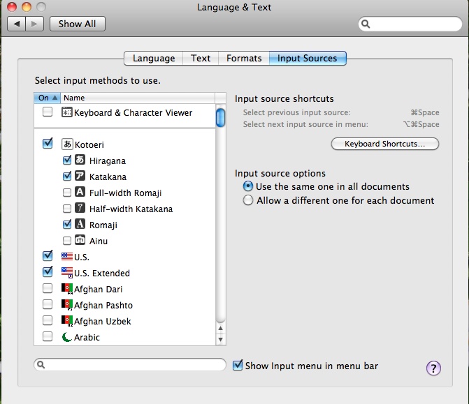
Figure 2. Mac preferences settings page. These settings
allow the user to input hiragana, katakana, and kanji.
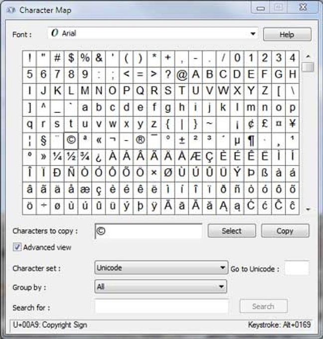
Figure 3. Example of Windows Character Map, Arial Font, Unicode Encoding
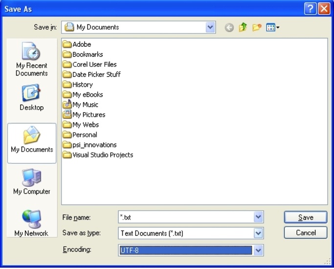
Figure 4 Saving a Windows Notepad File with UTF-8 Font Encoding
|
Tips for Mac and Windows/PC Users
|
Macron Character Findability in Web Documents
Some search engines (Google, Bing, etc.) “differentiate” between a macron character and the same character without a macron. So, for example, a search for the deity “Jizō” will yield different results compared to a search for the same deity written as “Jizo.” Also, most Internet readers do not know how to use macrons to conduct searches and would search “Jizo” rather than “Jizō.” What can be done about this? Writers who want their work to be “found” by Internet searches may use the correct spelling “Jizō” throughout the main body of the text, but also “hide” the incorrect spelling, “Jizo,” inside the document (1) image alt-tags for each photo of the deity appearing on the page, (2) as a meta-tag keyword (needed just once), and, whenever possible or feasible, (3) a visible note in the main body giving the two spellings. Use all three strategies on any single URL page address for best results. This technique can improve the “findability” by the general public and specialists alike if macrons are used. (Here is a site that incorporates all these strategies.)
Editorial Note
Nina Raj, Lynne E. Riggs, Richard Sadowsky, and Mark Schumacher collaborated in the compilation of these updates. An extended discussion of the subject of kanji in English texts may be found in the archives of the Premodern Japanese Studies (PMJS) mailing list.
Write to SWET for further advice and information on bilingual inputting for print or online publishing.
© 2012 SWET
(Originally published in the SWET Newsletter, No. 130; May 2012; all rights reserved. For permission to reprint this article, contact SWET)