January 4, 2013
Making a Good-Looking Book about Good Design
A well-designed object about Japan’s recent, well-designed objects, Naomi Pollock’s Made in Japan: 100 New Products was released in September 2012 by Merrell Publishers in the U.K. and is now readily available in Japan. On October 16, 2012, architect-turned-writer spoke to SWET about her new book. Her remarks about the making of Made in Japan, summarized here, offer insights into making decisions about finding a career niche, book composition and design, and writing in the world of architecture.
 I first came to Japan in the late 1980s, a newly minted architect with limited knowledge of the country and its language. During the planning period leading up to the trans-Pacific move, I had envisioned making a simple, lateral shift and entering a design office in Tokyo. When I got there, however, I found consistent cornice lines, well-defined street walls and material compatibility—all defining elements of North American architecture—conspicuously absent. Why did buildings in Tokyo look so strange? Determined to find out I became a Mombusho Scholar and went back to school at the University of Tokyo instead.
Responding to my questions, Professor Hiroshi Hara, my academic advisor, encouraged me with a sound suggestion. If I wanted to understand the “new,” I ought to look at the “old.” I ended up studying and writing my thesis on minka farmhouses, those fabulous thatch-roofed homes that once dotted Japan’s countryside.
This pursuit handily fulfilled my academic requirements, but didn’t quite satisfy my thirst for knowledge of current architectural trends. Fortunately, Japanese architects have a marvelous custom of hosting kengakukai, or open houses, before handing completed buildings over to their clients. As a graduate student in architecture at Todai, I received many such invitations and these events became an extension of my education. I attended every one I could, and through them quickly acquired knowledge of contemporary buildings and many currently active architects. When an editor friend in New York got wind of this fabulous experience, she invited me to write an article for her magazine. I happily accepted the assignment and wrote my first piece. Titled “Letter Home from Tokyo,” it appeared in the US magazine Metropolis in the early 1990s.
I have now been writing about architecture and design for more than 20 years. My work to date includes individual profiles, historical pieces, and articles on urban issues. Following the Great East Japan Earthquake in March 2011 I wrote a comprehensive piece about Tohoku’s rebuilding for Architectural Record. The primary focus of my recent writing, however, has been contemporary buildings, which I cover for an assortment of general interest magazines, newspapers and publications geared to the architecture profession, including the US magazine Architectural Record for whom I am special international correspondent.
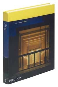
 After I got the hang of writing articles, I decided it was time to turn my attention to books. The first one was Modern Japanese House, published by Phaidon Press in 2005. Drawing from my thesis as well as writing and reporting experiences, the book opens with an in-depth overview that locates contemporary Japanese houses within their historical, cultural, social and technological contexts. It has five thematic chapters organized by house type: the tiny house, the indoor-outdoor house, the work and play house, the multigeneration house, and the vacation house. Each chapter contains profiles of five exemplary homes. My aim was to talk about contemporary Japanese society and culture through the lens of residential design, and in the process, I worked with 20 plus architects and almost as many photographers.
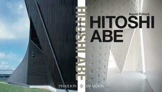
After that experience, I was eager to delve deeply into the work of a single architectural designer. In consultation with my Phaidon editor, the subject of my next book became I chose Hitoshi Abe, a rising architectural star from Sendai. Based on an extended conversation with Abe that spanned numerous site visits in Tohoku and interviews in Tokyo, I wrote Hitoshi Abe, a monograph published by Phaidon in 2008.
 Shortly after that, an unusual opportunity came along. A fellow writer who had missed the deadline for a book on 100 new Japanese buildings sent me a desperate plea. The request was to write 35 essays in four months, in exchange for which I would be co-author. Normally I would not have considered a proposition like this but this time I reasoned that it would be a good exercise in writing quickly, so I accepted her invitation., The result of that collaboration was New Architecture in Japan published by Merrell Publishers in 2010.
The idea for my latest book, Made in Japan: 100 New Products, began when I realized that I wanted to write a book for a wide, general audience. I knew that Japanese goods were popular items at museum shops worldwide, and it occurred to me that product design might be an appropriate subject. I realized that consumers everywhere appreciate the beauty, cleverness, and functionality of goods from Japan. Since many of the elegant kitchen utensils and desk accouterments are designed expressly for the domestic market, many non-Japanese have little access to information about the designers and their objectives. I spotted a need for a book that would fill that gap.
Many architects design cool objects and neat furniture, so I already had a foothold on the subject. I also had a number of wider contacts growing out of a position I held in the 1990s as a guest curator at the Art Institute of Chicago for a two-part show on Japanese architecture and design. I discovered that while there are books on the market about design history and Japanese pop culture, there was nothing available in English on product design. This opportunity to fill an empty niche made the project all the more enticing to me. Yet a lack of precedents is not always a selling point with publishers; if one publisher has already produced a book on a given topic, others know that there is a market for publications of a similar sort. Fortunately, Merrell was willing to take a risk and readily accepted my proposal.
In choosing the objects, I had a number of selection criteria. For starters, the products had to be aesthetically pleasing, functional, and have a story to tell about their concept, manufacture, or both. In addition, all of the designers had to be willing to meet me in person. Being visually oriented, most designers communicate their ideas with sketches and photos as well as words. To make the book more readable and engaging, I wanted my texts to portray the designers’ personalities—something I could best understand through face-to-face contact. But most of all, I was looking for objects that would inform the reader about today’s Japanese lifestyle. As with Modern Japanese House, I hoped to write a book that would comment on contemporary Japan by examining objects from daily life.
The book begins with a foreword by Reiko Sudo, who heads a textile design and production company called Nuno. Next comes a lengthy, introductory essay covering a wide range of topics that set the stage for the rest of the book. It includes a concise history of Japanese aesthetics, a brief description of important events in the development of Japan’s product design, and a discussion of space and how objects relate to it. Then comes an explanation of the concept of monozukuri. The word translates simply as “making things,” but is as much a mindset as a mode of working. Implicit is the heartfelt commitment to doing one’s very best by continuously evaluating and refining the product. Rooted in traditional craftsmanship, this notion is alive and well in many of the book’s featured items.
The profiles of 100 objects that make up the bulk of the book showcase a broad spectrum of daily use goods ranging from a thumbtack to a portable teahouse that opens and closes like a giant umbrella. The selections present work by an array of designers: large companies with in-house design capability, stars of the product design world, small design firms working on a contract basis, architects, and the group I call the “cottage industrialists” who design, manufacture and sell their own products. Each item is documented with a two-page spread: text on one side and a photo (more if needed to explain the object) on the other.
In terms of organizing the objects, I considered several different strategies but decided to order the book alphabetically by product name. This would give the book a slightly encyclopedic character, treat all of the objects equally regardless of their size, value or designer, and mean that the reader could savor the book in bite-sized pieces or read it cover to cover.
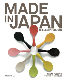
Fortunately, Merrell’s editor and in-house book designer embraced this structure, my two-page per product layout and also turned the notion of “100 products” into a strong, graphic motif that unifies the book. In addition to identifying every profiled item by number as well as name, a two-page spread composed of product thumbnails separates the book’s two parts, enabling the reader to view all 100 items at once. Merrell also welcomed my participation in the jacket design, resulting in the book’s hybrid hardback-paper spine construction and eye-catching cover. Adorned with an artful arrangement of colorful standing rice scoops, the bold image makes the book stand out wherever it is sold.
Since its release, Made in Japan has been warmly received on multiple continents where it has been the subject of reviews and previews in various design and general interest publications, including Wallpaper, Dwell, Icon and the Wall Street Journal. I was very surprised to learn how crucial social media networks are to book promotion—a big change since my last book came out. Indeed, the quickest and most effective way to get the word out is via blogs, websites and even Facebook. It is fascinating—and thrilling—to see information about the book propagate around the world.
Originally published on the SWET website, January 4, 2013.
© Naomi Pollock.
